The Kavorka
Makeup Brand
Product Design
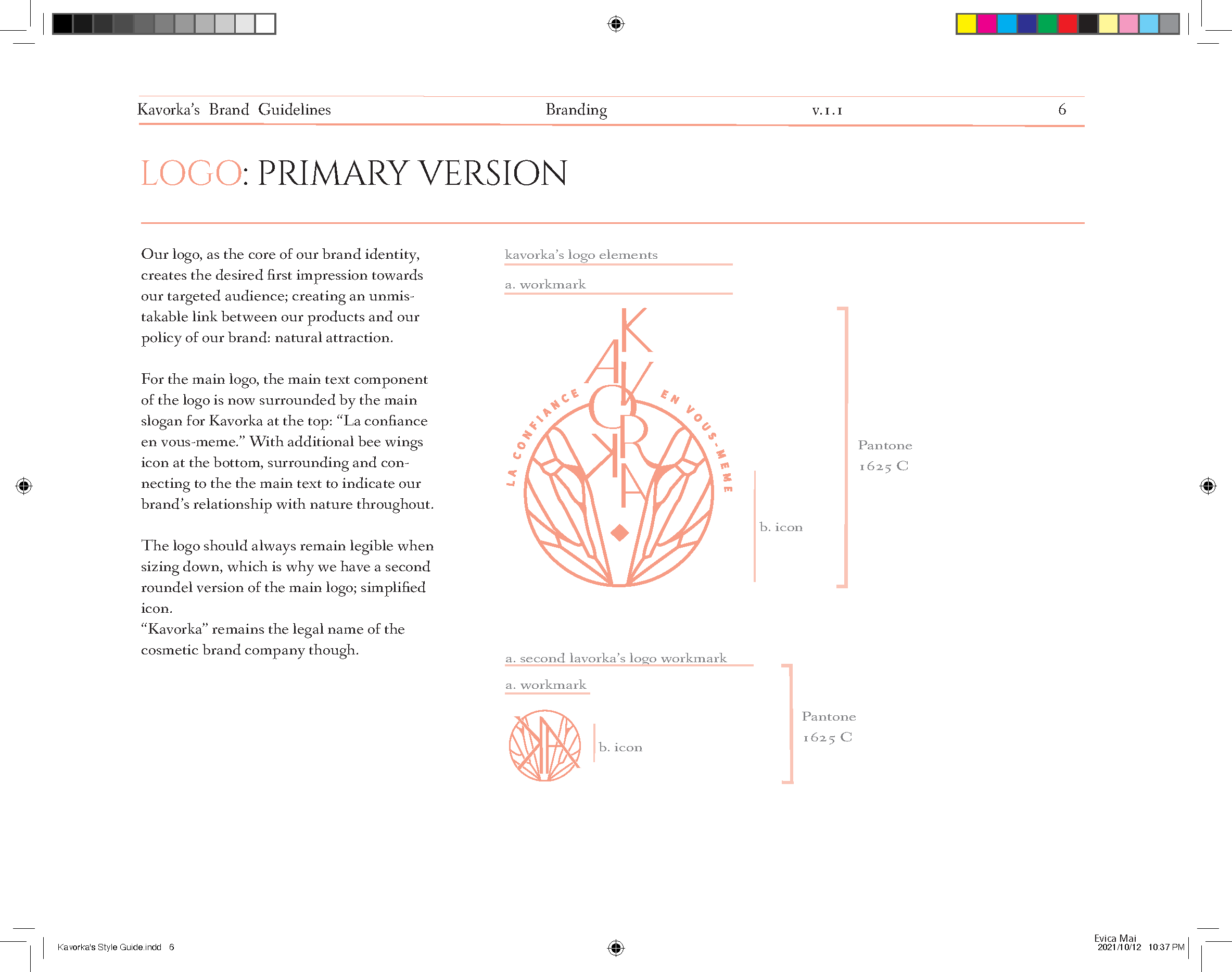
The Kavorka’s logo is comprised of the icon, the Kavorka workmark and French slogan: “la confiance en vous-meme” transalting to “the confidence in yourself” in Source Sans Variable bold font, surrounding the top of the workmark and icon. Altogether, they create the core of our identity: our logo. Kavorka’s brand identity is quite simple, similar to the nature of a bee’s honey. Providing a sleek light, but vibrant and transparent look to the audience, the logo represents the foundation of our brand’s nature. It makes our key targeted audience and other possible consumers to recognize and remember us as the “honey” for skin; make the statement of our pride in our recipe in being less than 1% synthetic; and helps us be transparent in our startegic collaborations with partners.
See More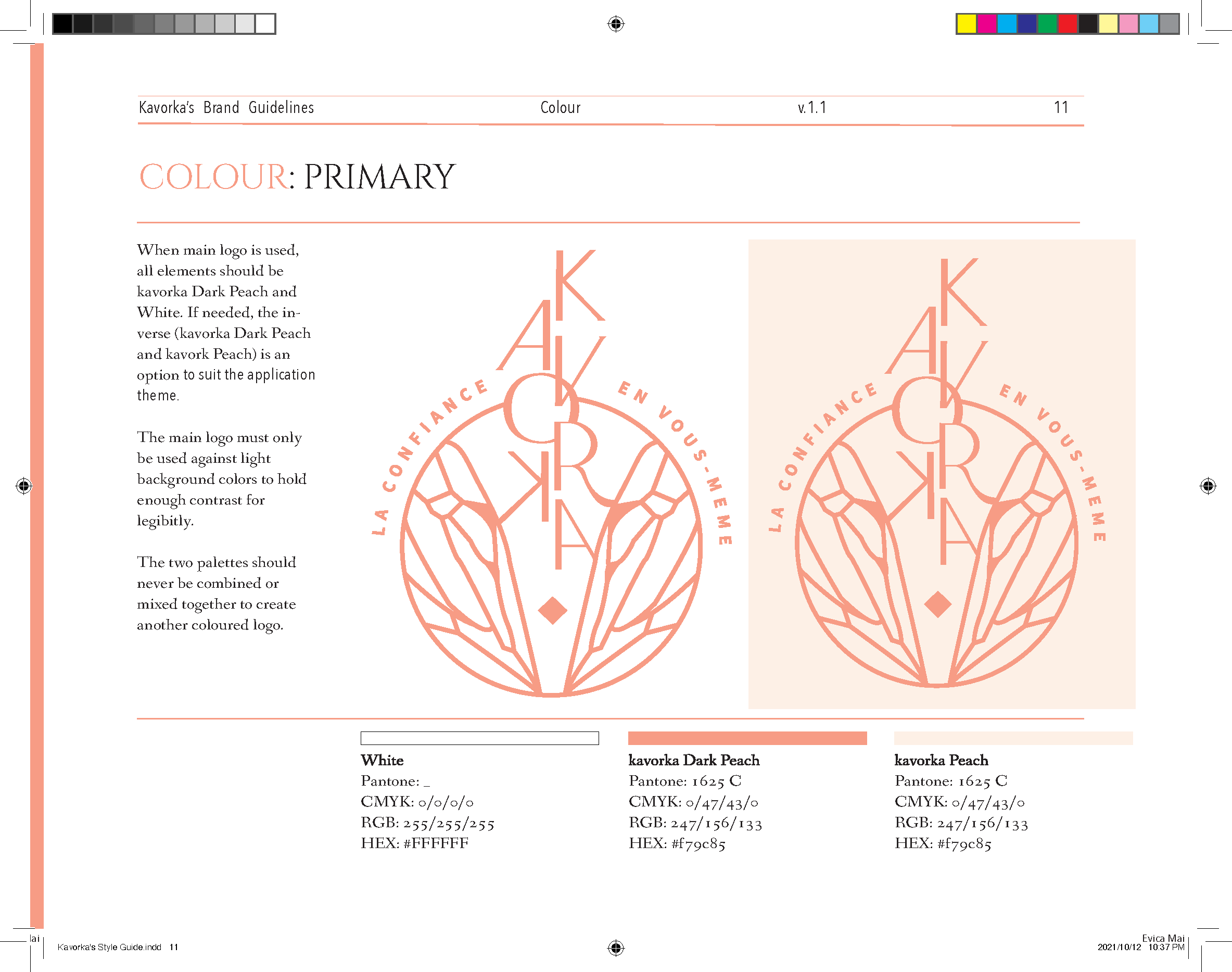
What Kavorka
represents
The main goal of the bee wing pattern icon, integrated at the bottom of the main logo is to envelop the symbol of the word and brand, Kavorka - natural beauty.
bees are known to be connected to the mythologic Greek goddess of argiculture and vegetation, Pesephone, who was known as the ‘honeyed one.’
the icon emphasizes the exciting experience we aim to create: look and feel light and refreshed
to display that people will want to be with you, be like you, be you.